For a Stockholm summer day, Monday on August 20, 2018, wasn’t so exceptionally hot. Sunny, yes, but not especially. Earlier that month, though, for several weeks in a row, temperatures had reached above average. There was a whole week with daily highs of 30 degrees. And so, while not so unusually hot for that month as a whole, it was on this Monday that Greta Thunberg, the then 15-years old climate activist – the first Monday following the summer holidays – decided not to go to school, but instead go on strike: a climate strike. As expected, “bold” soon became the word of choice in describing this seminal move of hers. But this was resorted to so as not to use another, “desperate”. And desperation is what drove the young Greta into action. Because this spirit of combatism and momentum we now associate with Fridays for Future, the outcome of that Monday’s school strike, owes precisely to the agitated desperation of a whole generation whose future prospects increasingly narrow down to one disastrous possibility. A possibility that no amount of schooling in the world is worth. And it is in this very first of the climate strikes – in opting for this form of protest especially – that are already inbedded the many facets of a crises that threatens to devolve into catastrophe. If strikes are a tool in the hand of a collective struggle for justice, then a school strike over climate change is tantamount, ultimately, to a desperate uprising against the unequivocality of a coal-emitting, resource-depleting future; its demand, then, is to open up the horizon of possibilities of life on this planet – socially, generationally, and in terms of climate justice. It is a call for a plurality of futures.
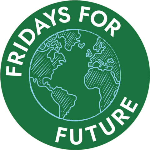
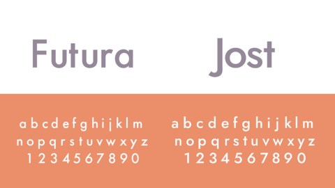
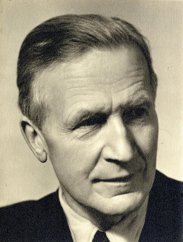
But now, to consider the constellation of these school strikes – so called after the recurring Fridays on which they take place – from the perspective of a designer looking into the movement’s branding might appear somewhat absurd. Does it matter that much what the logo looks like for a movement fighting for climate justice? To remark on the sidelines: This logo of Fridays for Future I don’t find particularly well-crafted. The choice of a Jost typeface, intentionally or not, indeed references the perspective of social justice from a graphic design standpoint; the typeface was developed as an updated iteration of Futura, its name invoking socialist designer Paul Renner as well as Heinrich Jost, the typographer. But that’s about it. The rest of the logo, with the globe scrawled down in light-blue over the deep green of a school chalkboard, set in a circle and encircled by white lettering, is far less innovative, not to say predictably conventional. “When a designer has no clue, he draws a circle,” goes the German saying, which seems to apply in this case. But so, would it apply to the Bauhaus, which likewise aspired to a world-shaping charisma.

Logo der Fridays for Future-Bewegung. © fridaysforfuture.org
But a logo, one might argue, is only the icing on the cake, maybe even the cherry on top of a branding effort. And so, with Fridays for Future, whose design must be considered beyond a logo that merely serves its purpose, a predictable color scheme, a typeface of some interest. Design is more than to consider the thing based solely on its surface appearance. Rather, the thing to note here is how it inextricably ties to a specific content that, only once rendered through this appearance, derives its specificity. Seen this way – from the perspective of an embodied design concept – we may now go back and look at the movement's very beginnings, all the way to that white cardboard sign written by hand in all caps: “SKOLSTREJK FÖR KILMATET”. Not so much because this placard, with its politically-driven spontaneous messaging, could stand for a one-of-a-kind design article, and hence non-reproducible, already from the beginning. More important is to understand what kind of role design was to play in translating an essentially subjective political drive into a collective, political framework. From a design perspective, it’s now worth posing the old question again, that of form and content. And seen that way we must think of the two together, as mutually delivered. From that perspective, this form of protest specifically – up to the level of its graphics – is what determines the content of the topics at hand and what helped launch Fridays for Future as a successful movement. This is how lines that are drawn, how a layout of words and images, can be the construction of a new, different world; how on the surface level of a graphic design, the aesthetic and political dimensions come to intersect, as claimed by philosopher Jacques Rancière in his The Surface of Design.

Typeface der Schriftarten Futura und Jost
This aesthetic dimension of the climate movement came under discussion in a public talk with Luisa Neubauer, the climate activist whom many in Germany see as the local face of the Fridays for Future movement. Part of a panel discussion on the greater issues surrounding the future from an arts- and design-studies perspective, I had a chance to speak with Luisa on the dispiriting notion of a “fatalist nowism,” an attitude ever more pervasive when it comes to crises on a global scale. Instead of looking ahead, of fighting for other possibilities in the futures, people burry their heads in the sand of the present and the status quo, putting their faith in short-term, solution-oriented damage control for as long as the old order of things may be sustained. With the general public settling into a stagnant complacency, this has the effect of dissolving the despair and urgency that Fridays for Future was able to frame for a whole generation. How come we’re not doing anything, or doing so little? How can we stand by and watch as the world goes down, partly due to our own fault? How can we move from knowledge into action? To answer these questions purely on a personal level, through one’s own actions, doesn’t take us very far, as Neubauer herself noted on several occasions. The impending climate catastrophe is the product of a global system of production, trade and consumption. Only through joint action and pressure on extra-parliamentary opposition – to which Fridays for Future, with its mass protests, had given a whole new meaning – can decision-makers set the tracks right and avert an all-out catastrophe. And what role do art and design play in setting climate policies? Aren’t the two just adding more works of art and design? Luisa Neubauer’s answer to that question links the systemic level with the individual one, taking us back to that intersection of the aesthetic with the political: “Obviously, design is there for beauty and visual appeal”. And beauty speaks to people on a personal level, it pulls them into its orbit and towards an engagement with a certain idea. The hand-painted posters used by Fridays for Future again serve as example. Not that they should all be the work of graphic designers. However, it starts to become clear what role should be played by the communication of ideas, how not every person is supposed to be a climate activist, and that each can contribute to change with their own means – perhaps just a painted poster.
Obviously, this beauty we see in the elements of a protest movement should not be misunderstood simply as design on a superficial level. In it, the politics of other, possible futures are tied together with an aesthetic of forms and color, those that have set this politics in motion in the first place. It links the question of a system change that can only occur through joint political action with our individual experience and handling of things of beauty, items that are the elements of a future system to come. Because in the end, it is out of this beauty that a realistic optimism might arise, the kind that is supposed to knock us out of this stagnant complacency of the present, to liberate us from this “fatalist nowism” we have settled into.
It is only on first look, then, that the role played by design in climate politics would appear marginal. The numerous creative actions by Fridays for Future, as recent as this June in Hamburg’s city center, tell us that every idea is in need of a form through which to convey itself. And this form is more than merely surface. It is in design’s pursuit of form that forms bring ideas into life, setting them in motion. These motions that carry the idea, propagating it like sound waves unto an environment and keeping alive the possibility of new worlds to come, is the great potential lodged in design, that of aesthetics and politics intersecting. As once commented by David Carson, the famed American graphic designer, if somewhat deridingly: “Graphic design will save the world right after rock and roll does.” But saying so, he might have forgotten about the subversive power and aesthetic potential of subcultures. The short-lived, scandalous spectacle of style pulls us away from our daily lives for just a short moment as it renders things conspicuous, even pushy, giving them a whole new meaning. Seen that way, design implies that nothing must stay as it is, that things can potentially change if we only want them to, if we shape them accordingly. Who knows, it is perhaps for an encircled logo to save the world, by upholding the image of a new, and environmental friendly world in front of our eyes.
